Why is the new Ezlo Protect application for iOS is not working on my iPhone?
It should use the same authentication information as on the ezlogic.mios.com site no ?
but I receive a “Login Failed”?!?
Why is the new Ezlo Protect application for iOS is not working on my iPhone?
It should use the same authentication information as on the ezlogic.mios.com site no ?
but I receive a “Login Failed”?!?
Good morning @Raynald_Gelinas ,
It is not working because the Ezlo Protect app is related to a new service we are about to release.
The current official app is Vera Mobile. The other app you can log in to with your regular credentials is MiOS (note that it’s in Beta stage).
Regards.
Hi
It´s time you have a available good app for Ezlo hubs. Not problem if it´s a payment solution.
We cannot ofer this hub to our customers because the app.
Notifications fails, fancoil thermostats don´t run … Using the mios app is not the solution because the horrible dashboard is not customizable.
Ezlo should buy the source code for HomeWave and do a simple refresh for latest iOS and Ezlo/Vera differences. I don’t imagine the original developer would be overly demanding on commercial terms since he’s abandoned it.
Homelink is no longer supported by the author but it was really a good phone app. Highly customizable and intuitive to use.
This in spades, seriously.
I’ve just compared homewave on my vera to the mios app on the ezlo hub. Goal was to switch on a power plug. Test was done on an up-to-date iPhone 12, with both apps not in memory.
Time take to switch on in homewave, measured from opening the app till visual confirmation in the app that the switch was triggered: 2.85s. Total screen taps: 2 (open app, click device).
First try in Mios, measured opening the app, waiting for the dashboard to load (which remained empty after 30s waiting, so gave up there) navigating to devices, finding the device by entering the name in search, toggling the switch and getting visual feedback: 45 seconds total, of which 30s where waiting for dashboard. Total screen taps: 10 (high due to typing the switch name (5 characters) to quickly find the right device.
Second try in Mios, after first loading ezlogic in my browser on my laptop, as this seems to impact the loadtime of the dashboard in mios: total 30 seconds. 10 seconds to load the dashboard, 20 seconds to find the right tile and waiting for visual feedback on action taken. Total screen taps: 18 (high due to the scrolling in dashboard to find the right tile)
Noteworthy: it takes more screen taps scrolling through the long list of devices than entering the devicename.
Guys, seriously, in 30 seconds I can walk down my stairs, get to the actual switch, turn it on and get back to my office on the first floor. The difference is massive. There is so much friction in using the mios app, that I actively avoid using it and finding alternatives.
You can use the “Vera” app… it has a native dashboard …maybe you can use this until MiOS updates its code base for a faster loading dashboard. (hopefully next version of MiOS we’ll have the default as native dashboard for now)
Agree with what you are saying, the Ezlo dynamic dashboard is also very slow to load for me if it even loads at all. If you have lots of devices scrolling down the dashboard page takes time to then find the correct device and control it.
I was thinking of doing the same kind of speed tests, but with Home Remote app vs Mios app.
I can use Home Remote within seconds to launch it, navigate to a room then find and control a device.
In Mios the same thing takes minutes.
The old Vera app is an alternative and can be faster indeed as it directly represents the devices. Under ideal circumstances, it’s also a flow with 2 touch actions and result in < 3 seconds.
I do try to avoid that app as well, I have a doorbell connected and if the vera app is in the background on my phone, it tries to connect to my carkit as a phone as soon as I start my car. Only terminating the app really helps to solve this.
Then next time, when opening the app, there is a (random?) chance that it shows the login screen, letting me select control of my old vera or the new ezlo hub. This takes again a lot of time.
So even though the Vera app can be fast and frictionless, I guess the issue not knowing how long things will take when opening the App, makes me use it as little as possible.
You can do the same in the new Mios app also, click More then Devices and it will then show you the traditional Devices list as you see in the old Vera app under “Devices”.
I think you did that already as you mentioned searching for devices. Search now works in the Android MIOS app, after I submitted a bug report, as it was crashing the app every time you tried searching for a device before.
The difference is that you cannot select which devices should be visible. In the Mios App, I have a list of 71 devices, where roughly 4 devices fit on a single screen. That’s a lot of scrolling. The Vera app lets me select a limited number of devices (or scenes) which is an improvement.
In homewave, I can fit 72 devices on a single screen if I want to, mixing scenes and devices in one go. Which is overkill (and probably UI disaster). I think I have about a top 10 of most used devices/scenes that will cover >95% of app use.
All other control is either trough automatically triggered scenes, physical buttons round my house or really exotic one-time use, where ezlogic web UI will suffice.
Indeed.
we’ll release the next MiOS app with those being the default.
yes Vera app pretty decent from flexibility point of view…happy to take your feedback on improvements though.
Come to think of, I just counted most used devices in Vera and Homewave combined, it really does top at out 10.
Of course, dashboards can be very fancy / completed etc. But I would be interested to know other users view on this, how many tiles/buttons are really needed to cover >95% use for you guys? If most users have a very limited list of devices, that could drive app and/or dashboard design…
Yes you are correct in the old Vera app you are referring to a function called “Legacy Dashboard” or possibly “Dashboard Pro”.
This is the “Dashboard Pro” for example where you can select only certain devices to be shown. You can also create your own “Sections” and add devices into those as well, for example I created a HVAC section.
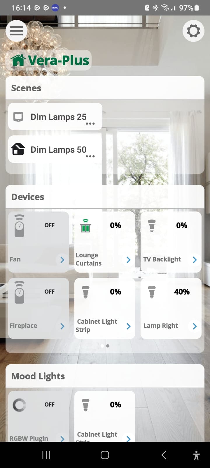
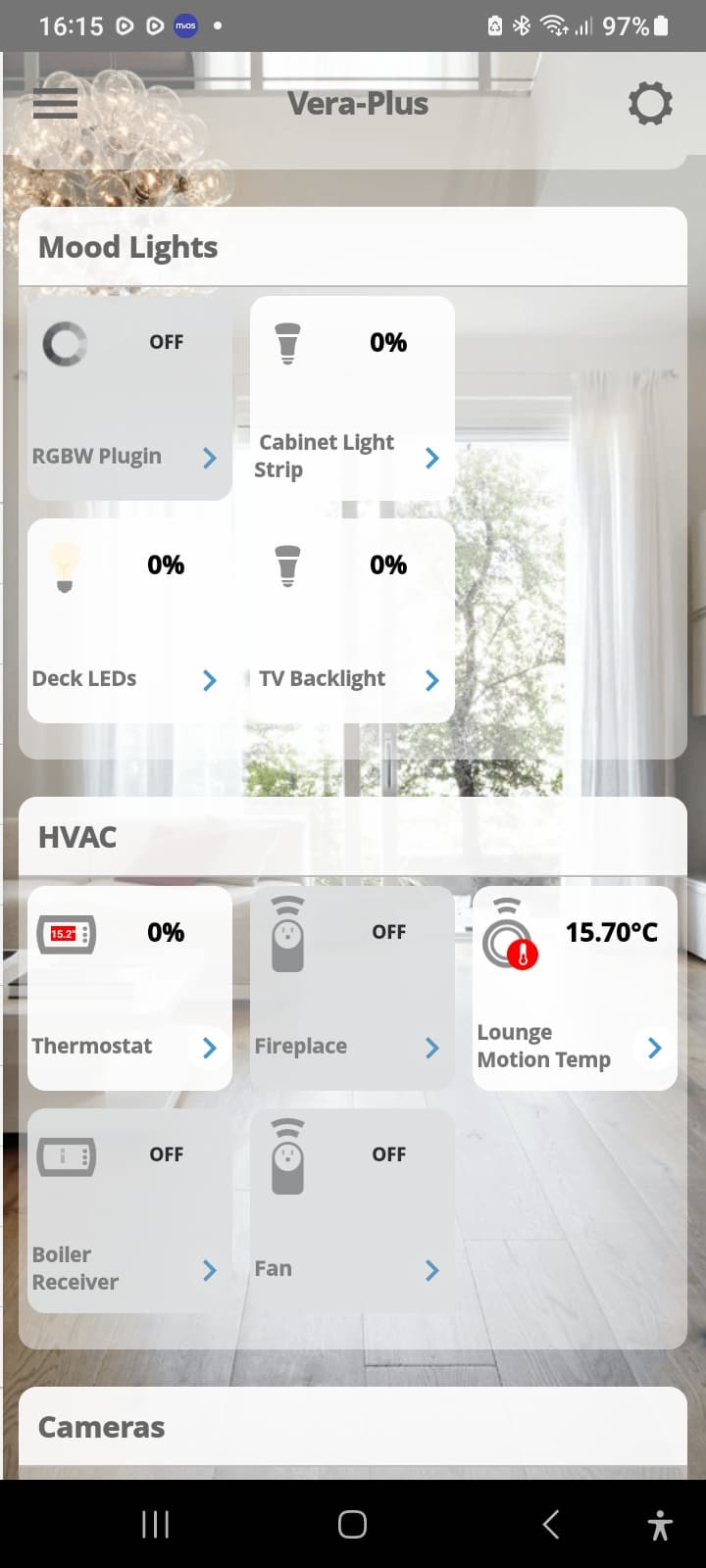
We have no such feature in the Mios app with the new dynamic dashboard as yet, where the user can create sections and add devices into them. At the moment as you know you just get a big long list of everything on the dynamic dashboard all at once, listed by rooms.
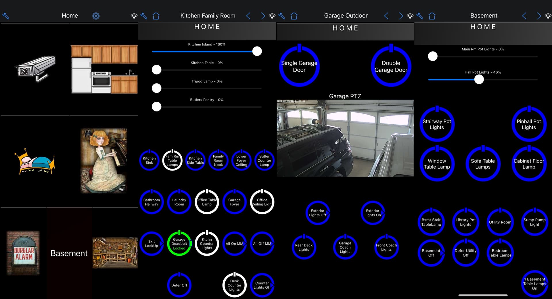
The power in Homewave is you can design the screen and icon sizes as you like. Big, medium, tiny. You link them to a device of your choosing so you can group things most important to you. You can also load clip art for the icons. You can have buttons for devices and scenes. Its all done on the target device, no compilers or code transfer.
Here are a few (four) of the screens in my iPhone. The leftmost is the home screen.
As far as I have heard Ezlo are also meant to be developing their own more advanced dashboard designer application. This would be separate from the Mios app and be more like Homewave / Home Remote functionality where you can design and build your own dashboard pages from the ground up.
In the meantime however I feel the Mios app needs improving, so the user can create dashboard pages based on the default tiles and based on the default dynamic dashboard, but where the user can do some organisation and have a page(s) where less devices are shown at any one time and only the ones they want to see, similar to the “Dashboard Pro” feature in the old Vera app.
indeed we are.
After using domotica now for about 14 years, I’ve really become a believer of domotica to be something invisible. If my domotica system was intelligent enough, there would be no need for any button / dashboard. So the whole idea of an advanced dashboard design in my opinion really creates little value.
Or course, there are countless beautiful HA dashboards on various fora, and there are people out there willing to spend a lot of time on tuning these dashboards into perfection. But in the end, a beatiful screen with nested navigation is not the perfect way to turn on a light.
Compare this to the current automotive trends to move away from physical buttons to touch-everything. Aside from the safety aspects and the issue of selecting a small button on a screen while conquering a speed-bump, the user-friendliness has decreased to make way for marketing and sci-fi promises of high-tech screens. In actual tests, drivers are able to perform common tasks much quicker with traditional interfaces (up to 4 times actually). So please keep things as simple as possible.
If I look at the current Vera App ‘dashboard’, it’s already overcomplicated to me. Look at the second example posted by cw-kid above, there are 9 actual scene buttons on this screen. More won’t fit. The buttons take up 33% of the pixels on this screen, while 67% is taken up by clutter / fancy things etc. etc. (not adjusted for the android top and bottom row). It’s nice, but not really usage oriented…
Depends on the users needs and point of view I guess. Personally I like a nice looking and functional dashboard application. But I understand what you are saying and if you automate most things with scenes then a dashboard maybe less important to some.
I am currently using the 3rd party Home Remote dashboard application and mine looks like this:
https://community.ezlo.com/t/the-home-remote-dashboard-app-demo-video/214816?u=cw-kid
It only works with my Vera Plus though as it does not support Ezlo hubs unfortunately. But its all local and very fast.
I don’t ever see a day where I can think of all the scenarios in which I use the controllable devices in my home such that I have created a scene or meshbot for every use case. So to me its either control the device by the in-Wall switch or via the application. Since many of my table lamps are plug in modules (a-la DZPA1-2BW) its not convenient to turn the light on via a button press on the module behind the sofa. So there I use an app.
I agree spending hours on a pretty interface isn’t a good use of time but that is why I like homewave. I am constantly tweaking it. Adding removing devices, relocating things. The paint is always wet on this canvas.
To me the features that I like are:
The inability to tailor the desktop for Ezlo has been one of the key reasons I have left my primary home on Vera Plus and HomeWave.
Best Home Automation shopping experience. Shop at Ezlo!
© 2026 Ezlo Innovation, All Rights Reserved. Terms of Use | Privacy Policy | Forum Rules